Designing a typeface
This project has spanned years. In the interest of holding myself accountable, I thought I should document my (slow, plodding) progress.
The PREP wordmark always felt like it wanted to be a full typeface. The mark is comprised of four letters (an acronym for the occupational therapy intervention it represents), and as I was drafting it, I couldn’t help but imagine what the other letters of this alphabet might look like as an all-caps display font.

The idea sat dormant for quite a while, but it continued to tickle my brain. So finally, a few years ago, I sat down and started building out the other letter forms. But let me back up…
Where it started
My first foray into typeface design actually began back in 2018 when I discovered the amazing Fontself plugin for Adobe Illustrator. I loved how it made font design accessible and integrated into software I was already familiar with.
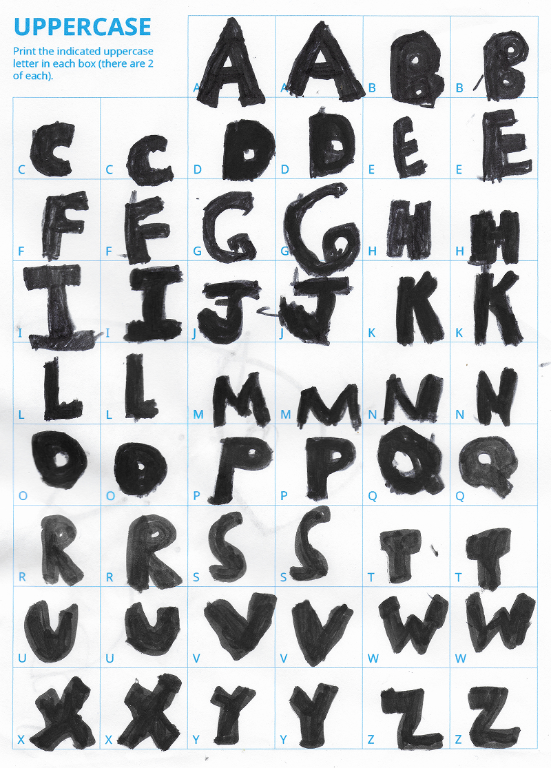
I wanted a project to start getting familiar with the tool, and decided to create a font based on my son’s printing style. I created a work sheet for him to draw out the letters with a marker (two spots for each character for a bit of variety), then scanned and vectorized the letters, did a bit of clean up and dragged them to the plugin panel. A few tweaks and a quick export gave me an OpenType font file. It was thrilling.
I’ve since purchased their iPad app as well…though I’ve found using the Apple Pencil to create letter forms doesn’t give me the precise geometric control I want.
“Jonas Hand”
The final result is pretty basic (limited glyphs, no alternate characters). But it’s a real live boy er…font! Give it a try yourself:
But I digress
I initially created the vectors for the PREP typeface in Adobe Illustrator, but I didn’t think the Fontself plugin could give me control over all of the details necessary for a proper font. Around this time, I was using Figma more and realizing its vector tools were excellent, and in some cases preferable to Illustrator’s. So I exported my work to Figma and kept building out the letterforms there.
But the idea of using fit-for-purpose software kept nagging at me. I signed up for a workshop called Making Your First Font with Dan Cederholm. It struck a good balance between theory and practical instruction and it gave me a boost. The suggestion to skip typical design tools and start in a proper font editor confirmed my suspicions and the recommended tool was Glyphs. A code for a free trial was offered; I tried it out but was immediately overwhelmed with learning new software.
Where I’m at today
Recently, in a shameless attempt to motivate myself, I sprung for the full license for Glyphs 4 with the intention of really digging into it. And guess what? It’s working…I’m making progress!
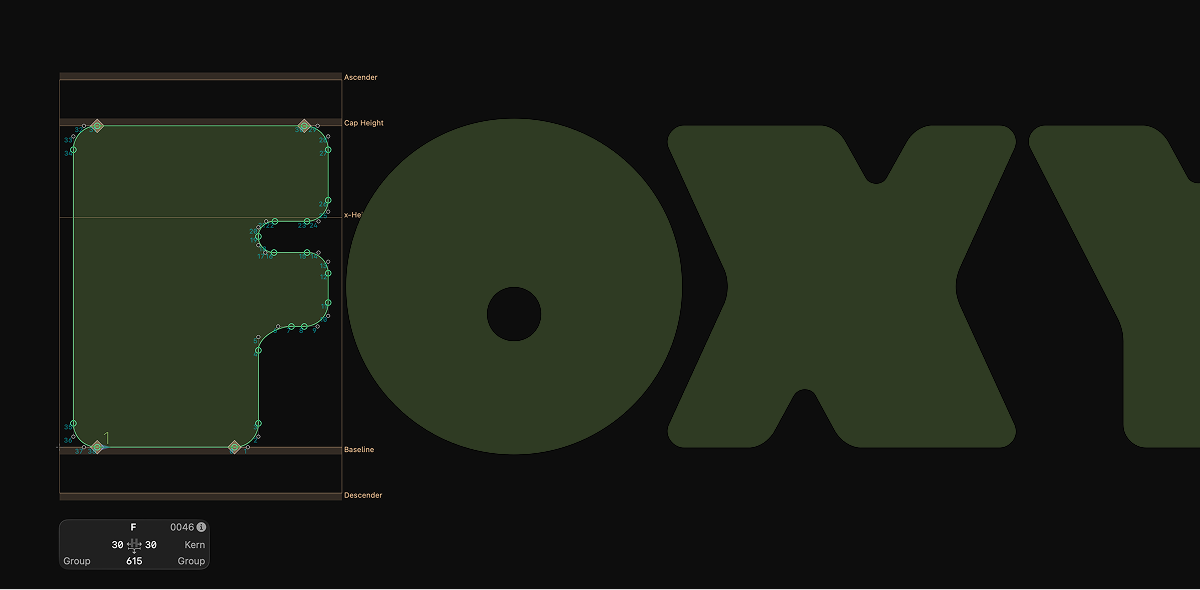
Sample of my PREP font in Glyphs 4…she is a foxy lady.
Try it out
It’s still a challenging endeavour: I’m not loving the ampersand and I cannot figure out how to make the @ character fit with the family…but look at me talking about sidebearings and kerning pairs! Here’s what I’ll call v0.1. Take it for a spin and let me know what you think:
What’s next?
It’s a fairly fleshed out typeface, but it’s far from finished. I’m noticing inconsistencies in letter proportions, there are several missing glyphs, I need to refine the spacing and kerning, and it needs real world stress-testing. (and there’s still that darn @ to contend with)
I don’t have a clear plan for what I’ll do with the font; maybe I’ll try selling it (and navigating the details of licensing and payment processing), or I might just give it away for free. Stay tuned to find out!
